UX & UI Designs
SHOP Experience
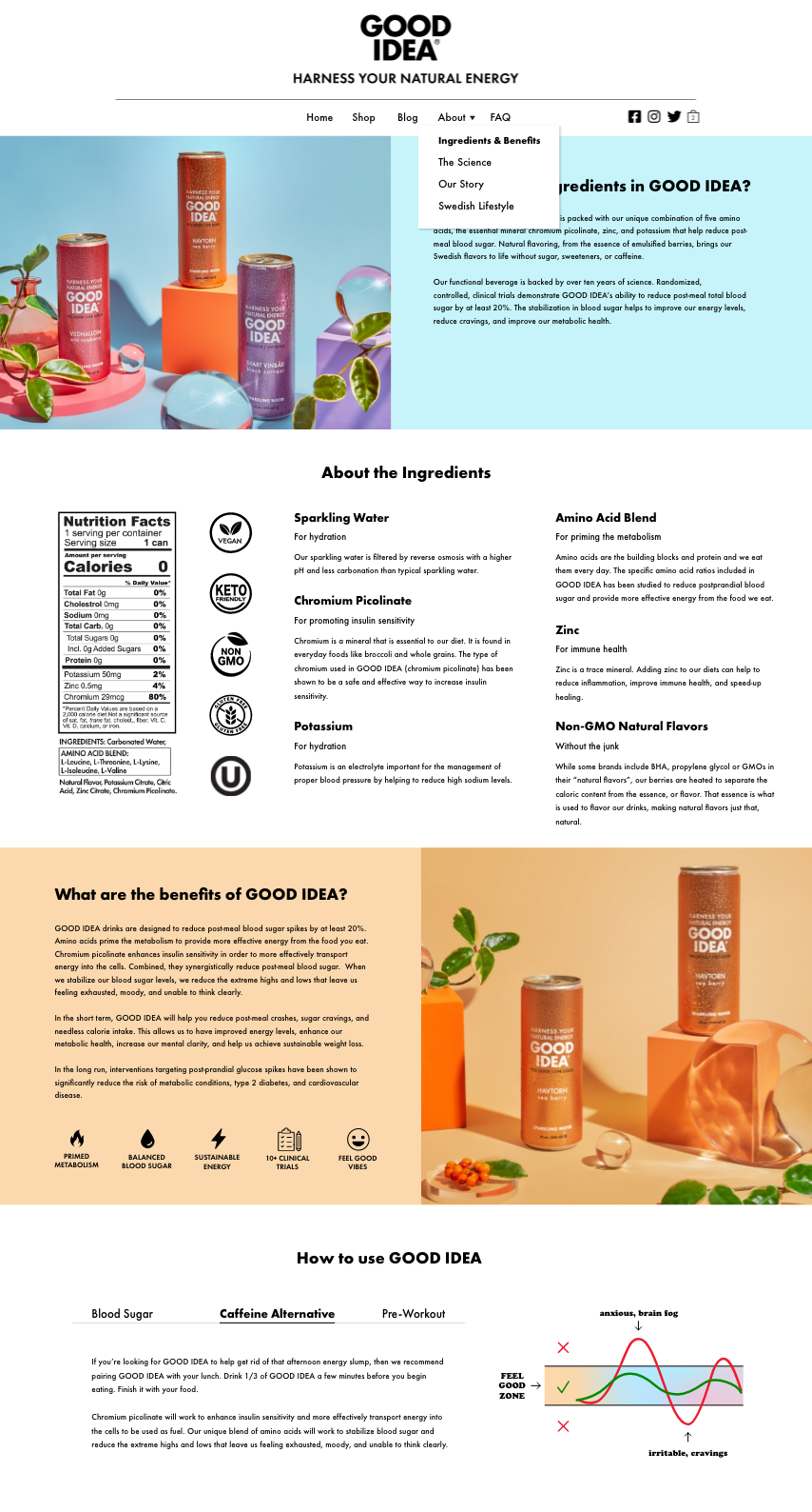
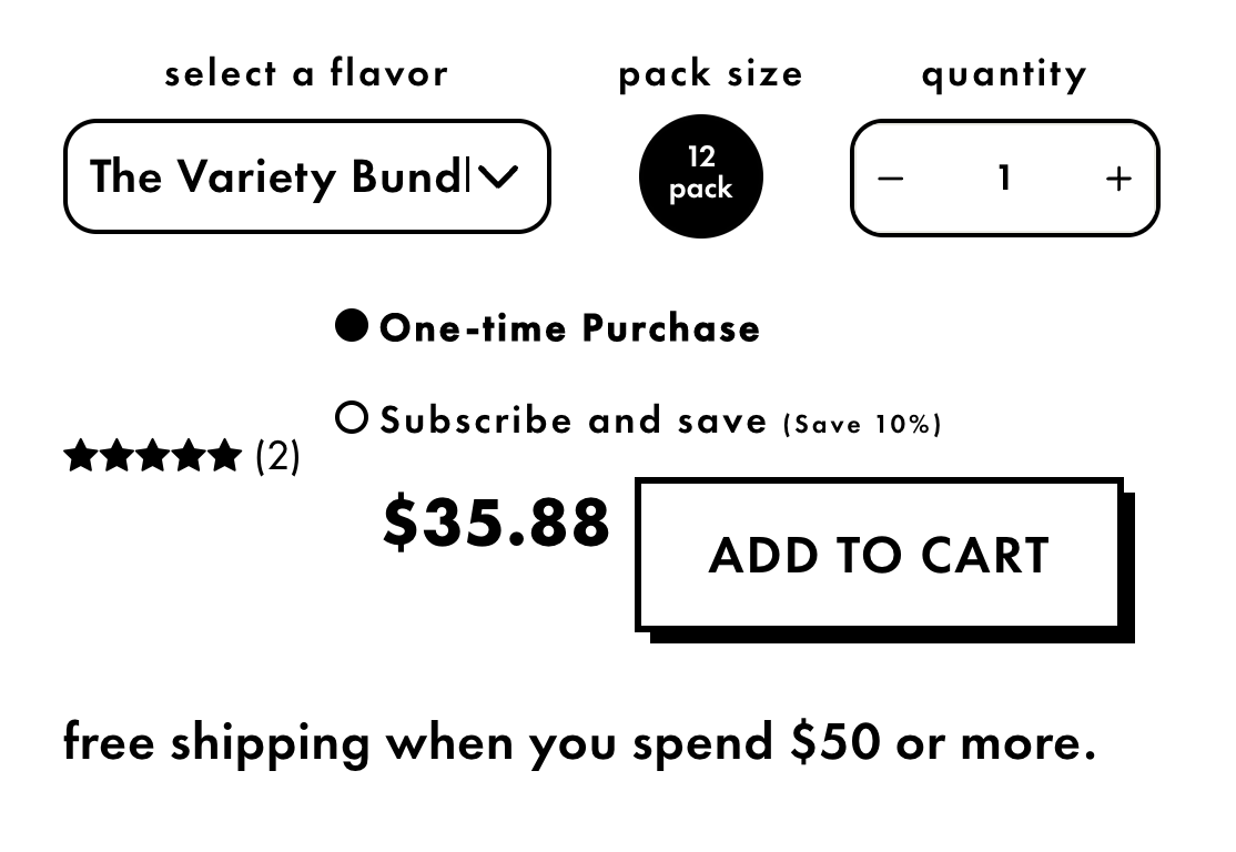
1. Adding a 12-pack to the shopping cart
The most common task a user will do on the GOOD IDEA website is to buy our sparkling water, so this will need to be the smoothest user experience! When adding a wild raspberry flavored 12-pack, it seems hard to follow with the reviews on the left side of the radio buttons of one time purchase and subscriptions. All UI elements seemed a bit clustered together as well; some spacing would help here. Visual hierarchy would be of good use as well:
AFTER
BEFORE
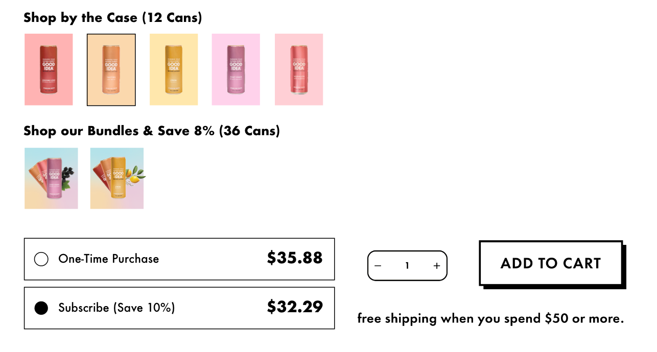
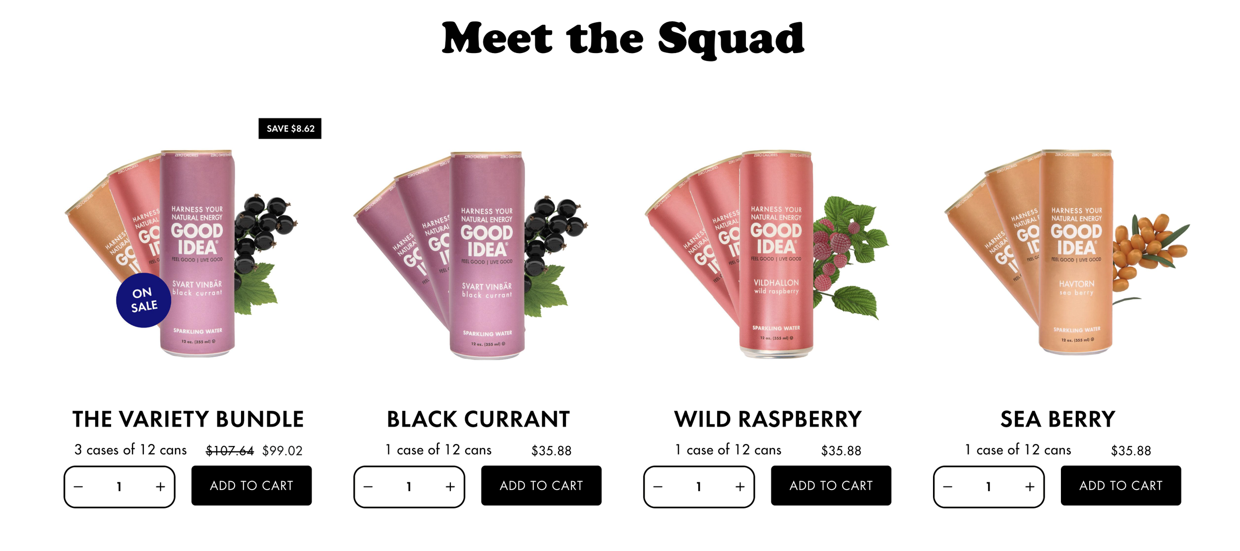
2. Responsive Design
- When adjusting the screen size on a web browser it seems that the responsive design has a hard time to reconstruct for some sections. Here's an example of the 'Meet the Squad' section:
FULL SIZE
1/4 SIZE
HALF SIZE
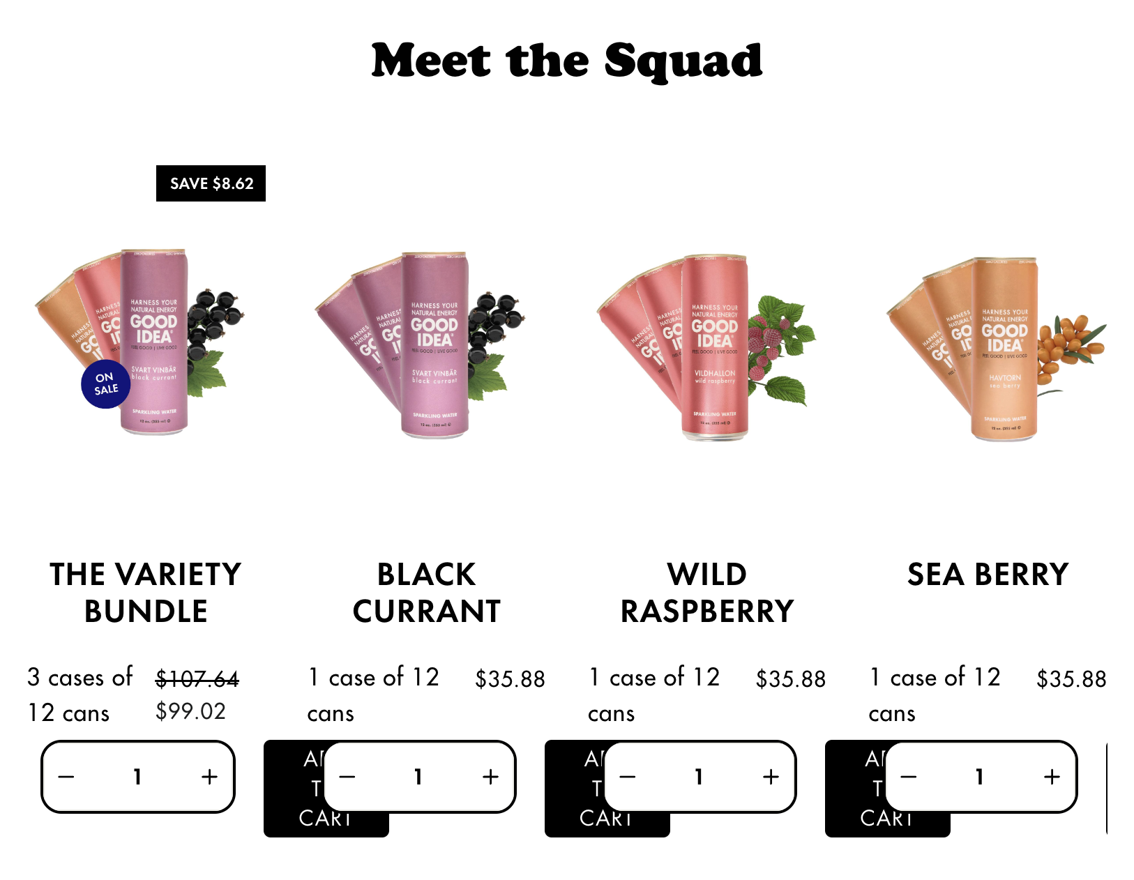

It only shows the variety bundle with no select quantity or 'Add to Cart' button. This could be solved by having all products stacked. Additionally, 'The Variety Bundle' and 'People are Talking' text are very close to each other, not showing any section separation.
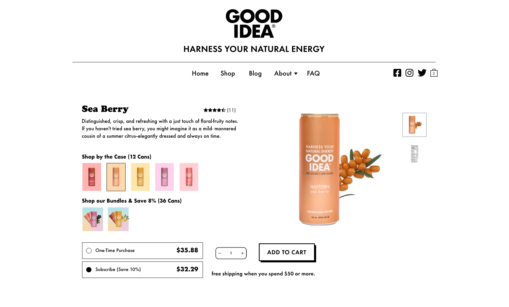
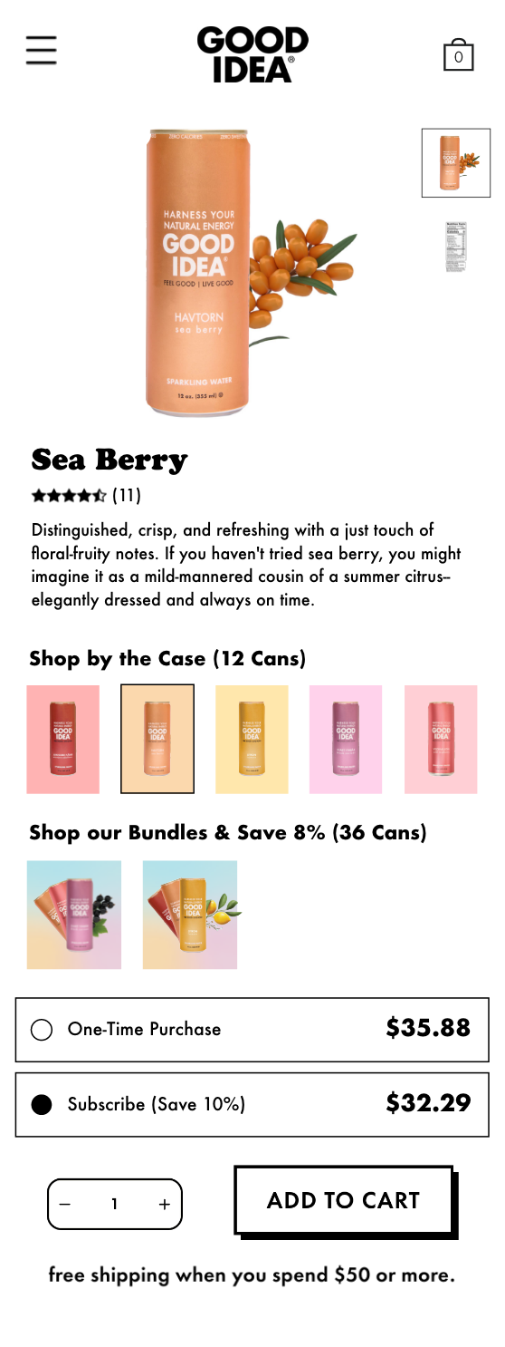
FINAL PRODUCT
Using Adobe Illustrator and XD, I was able to create an easier user experience including all flavors with images, rearranged shopping elements that can be easily followed and responsive design improvement. Final designs were transferred to Zeplin and additional notes were taken for the developer.
WEB BROWSER
MOBILE BROWSER
Ingredients & Benefits Page
Common complaints about our website was the user requesting what are the ingredients in GOOD IDEA! As we provide in all our email campaigns and right on the actual product page, user still felt confused where to find more information about what the sparkling water holds. This resulted in creating a whole separate page in the top navigation. Still keeping the user engaged and all information in place, created layout, imagery, interactive ‘How to Use’ tabs and more!