Fittivity
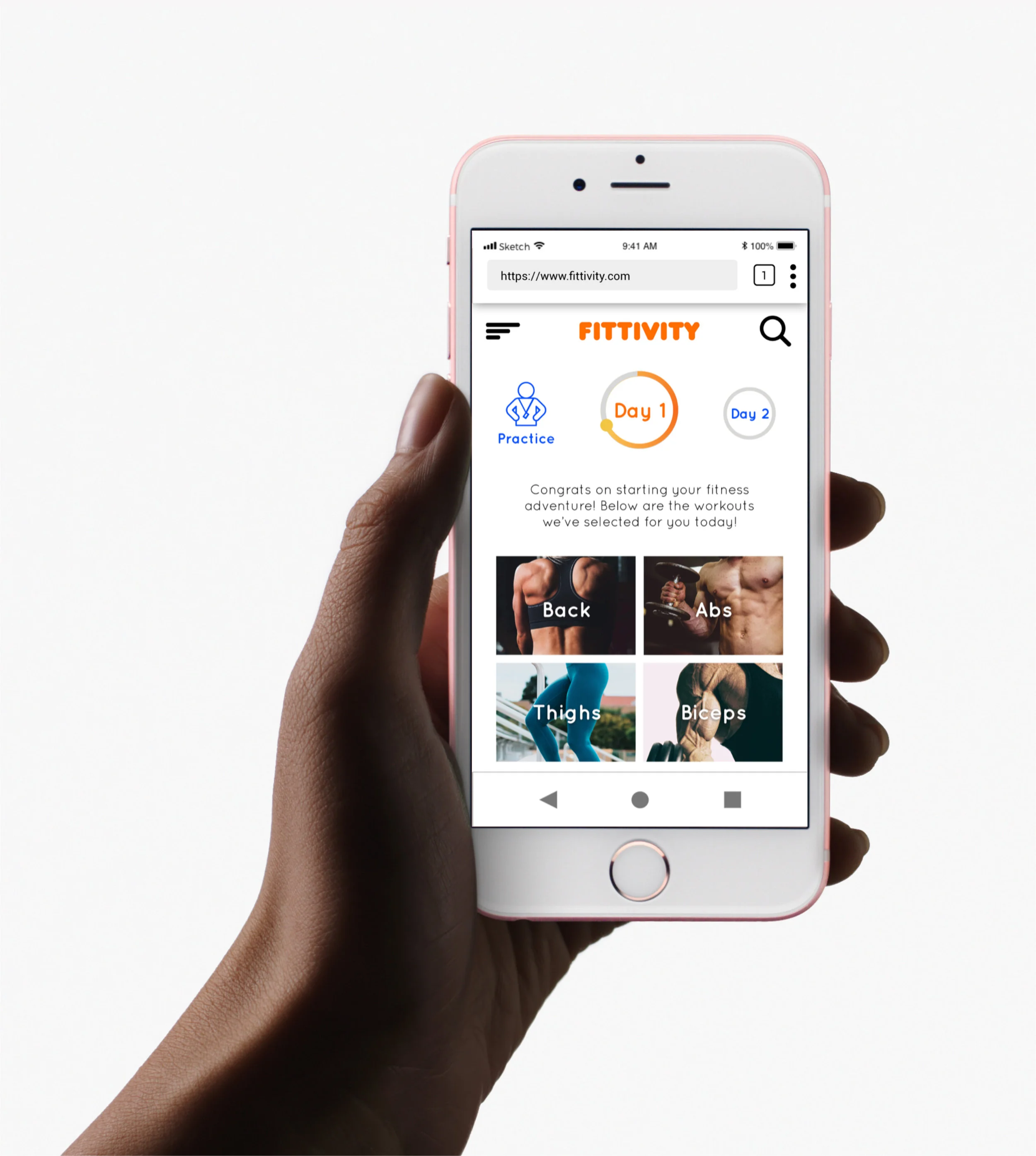
Fittivity is a fitness responsive app that motivate people into an exercise routine that suits their level, schedule, and interests. When on the go or when practicing exercise routines at home, in the park, on the street, etc. Users can stay fit anywhere, as long as they’re logged in on a device.
Context
Firstly, finding exercise routines for your level can be difficult, especially if you want to try something new. This responsive web app aims to help people get into an exercise of their choice by holding their hand a bit and providing routines, guides, interactive examples, and info.
Secondly, finding routines that fit into your schedule is not easy. The web app is designed to encourage people who want to exercise get into an easy routine for physical activities. This means fitting in as little as a 5-minute routine.
Purpose
Fittivity is a UI assignment from the CareerFoundry course. Since most of the UX research was already completed, my work consists of Wireframing, Color, Typography, Imagery, Icons, Interaction Design, Style Guides.
User Flow Diagram
After reading Fittivity’s feature requirements and user stories from the project brief, I created a user flow diagram that the user can glide through.
Low-Fidelity Wireframes
After creating my user flow diagram, I created low-fidelity wireframes to show the general layout, functions and features of Fittivity.
Layouts and Grids
In order to make Fittivity more organized and uniformed, I laid out each content consisting buttons, images and text by using blocks. I then applied grids to each screen to ensure proper spacing.
Mood Board, Color Scheme & Fonts
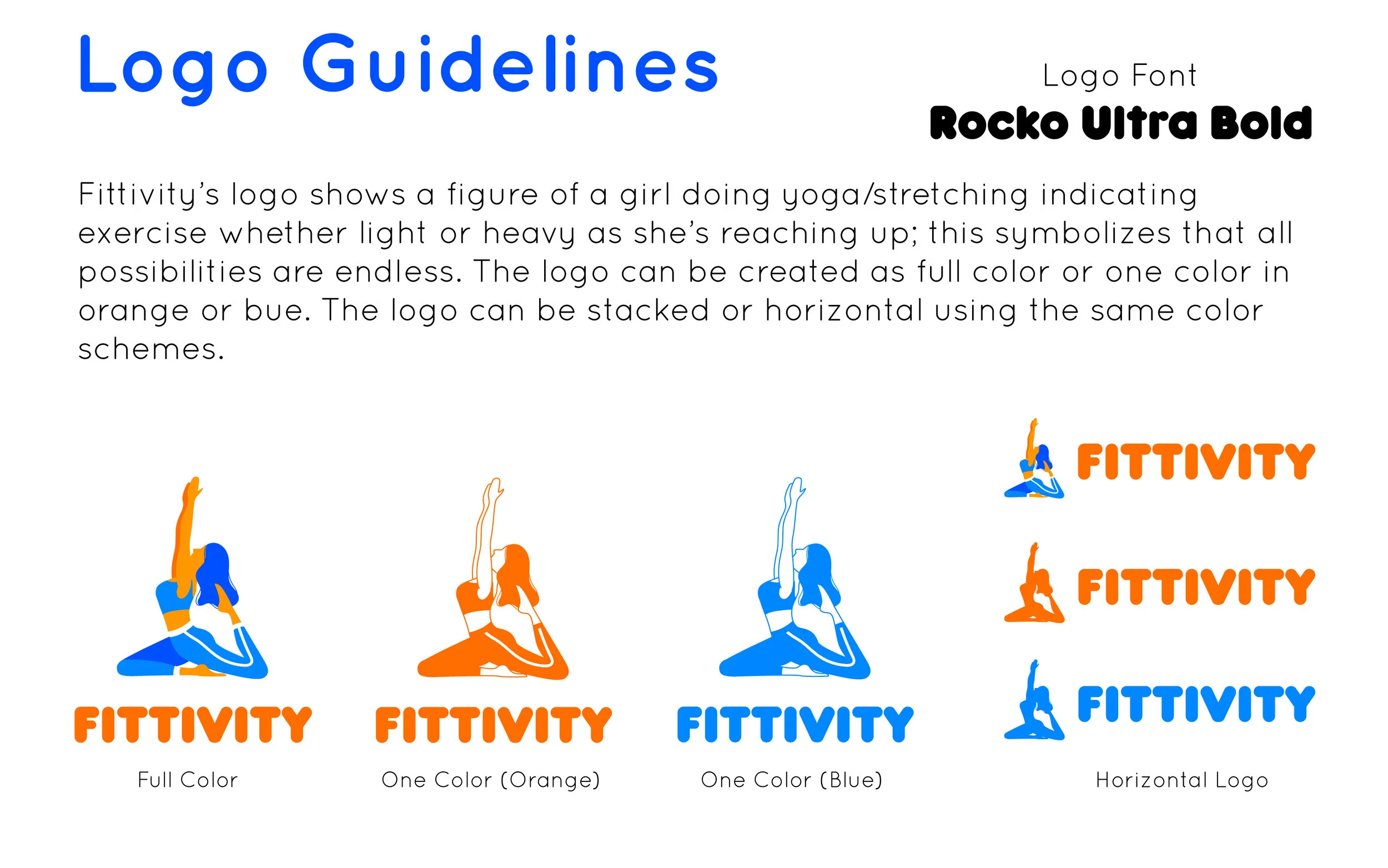
To create the identity and mood for Fittivity, orange and blue are the perfect complimentary colors to represent fitness as this can be a great way to make things pop. This theme is very easy to grasp; it’s very poppy, fun to look at and a great theme for beginners and all kinds of users.
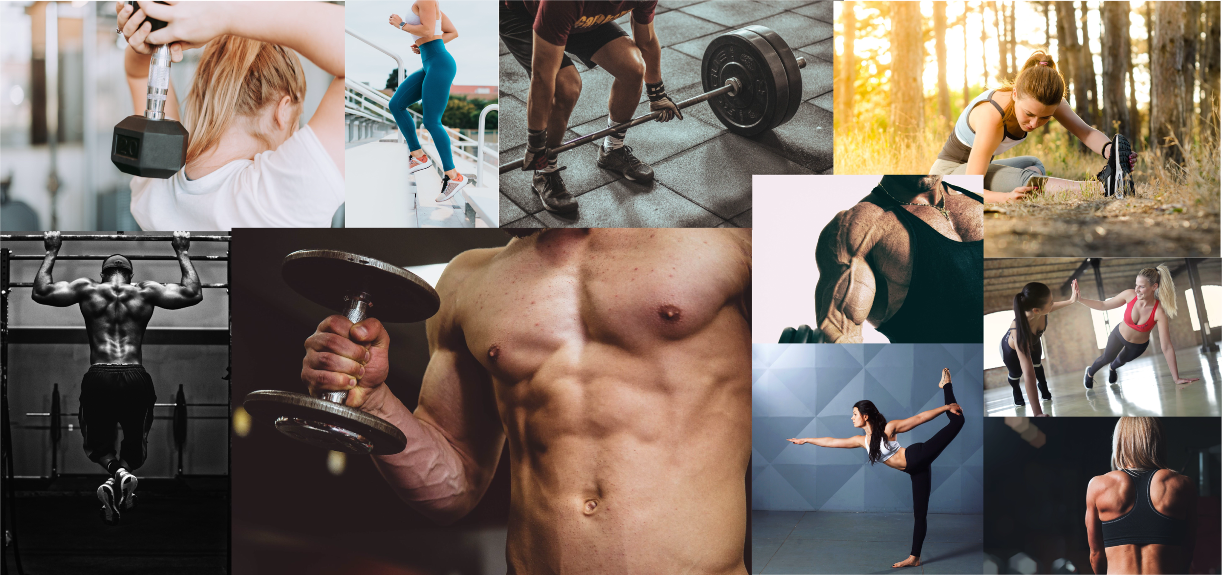
I chose this mood board because many users do not have as much time to get way deep into fitness, but still need something to make great habits and something alluring to come back to and motivate to keep trying.
The fonts and typeset needed to be easily readable, but also eccentric and engaging.
Imagery
Selecting the appropriate images are crucial for a web app. Appropriate images are focused, great/interesting lighting and fitness related material. They are high quality and great angles. According to the purpose of the app design it must also be photos or images that are related to the app; this means that it must be images of fitness, working out, and exercise related.
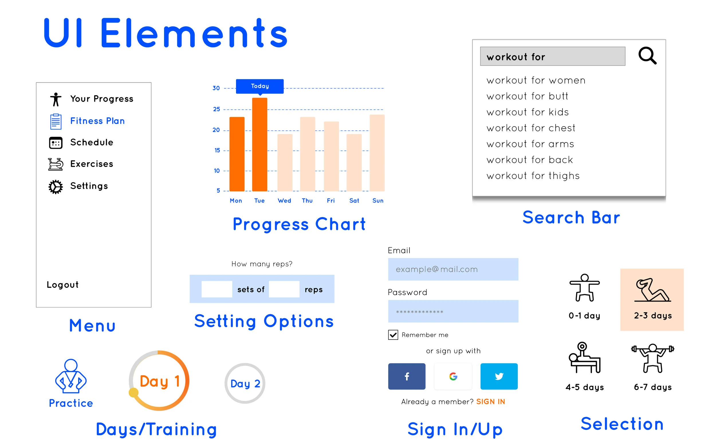
I selected icons that were needed for each function for Fittivity. Users need to be able to open menus, view their progress, schedule an exercise session and more. The best way to represent a function is a related and understandable icon.
Animation
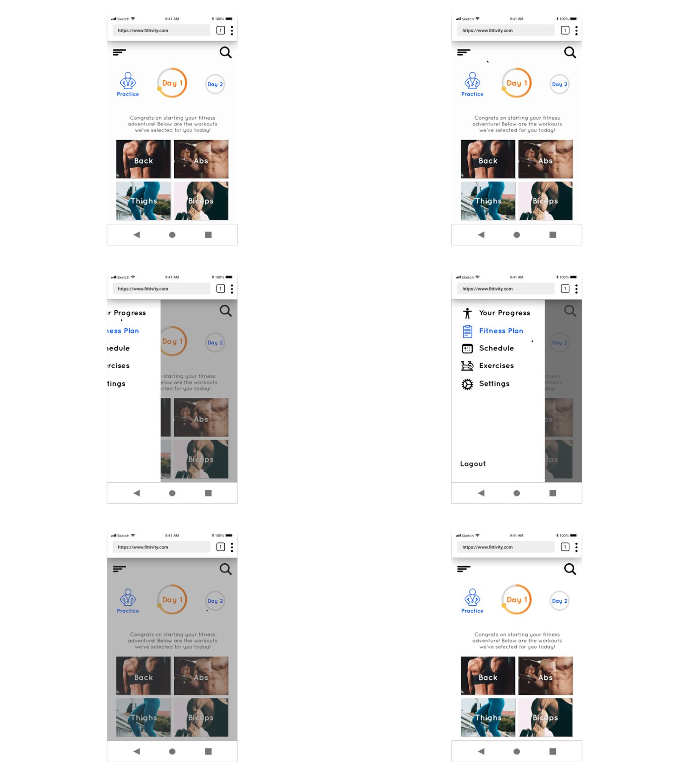
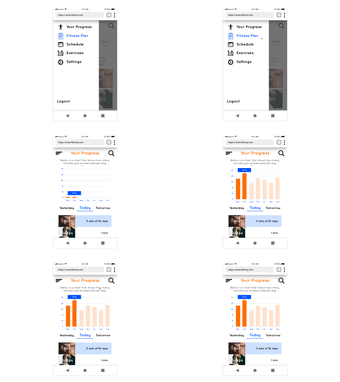
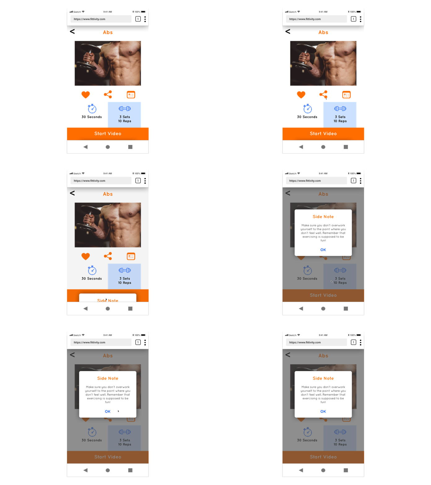
Gestures and animations are ways you interact with mobile devices, including tapping, swiping, pinching, and more. Fittivity delivers more than just a novelty of touch-screen interactions, they are engaging, and feel intuitive to users because they are a closer representation to how we interact with the real world.
Different Breakpoints
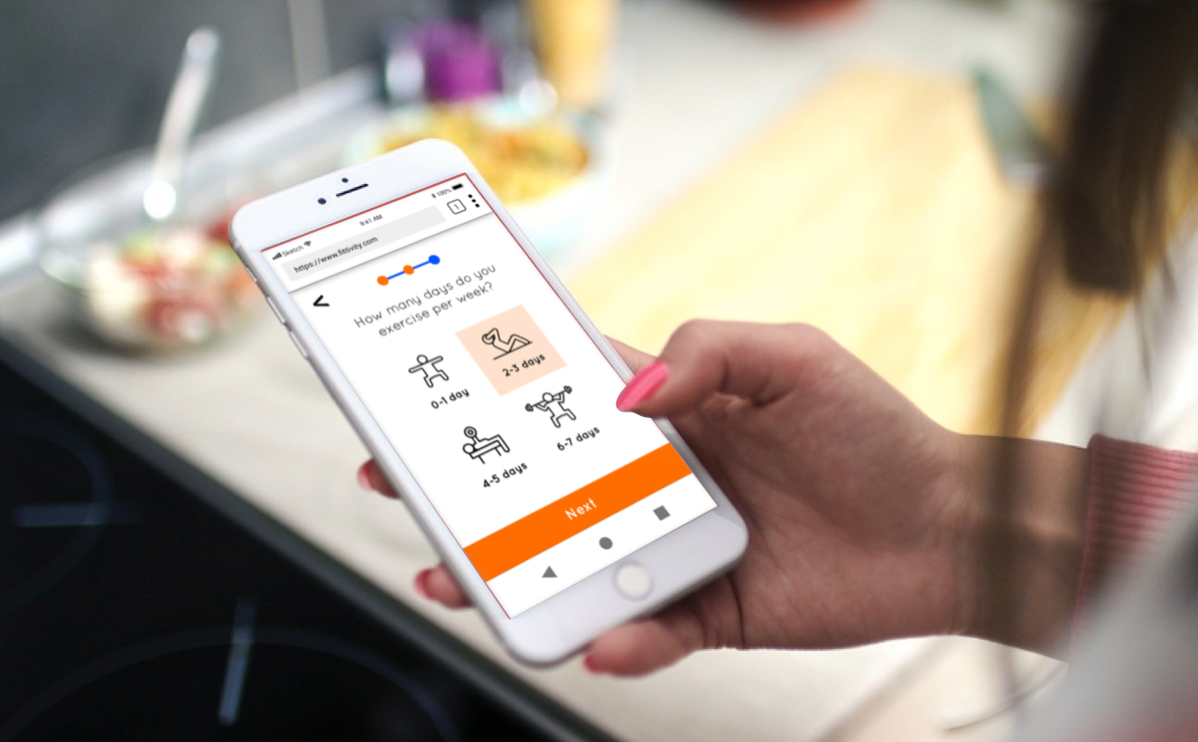
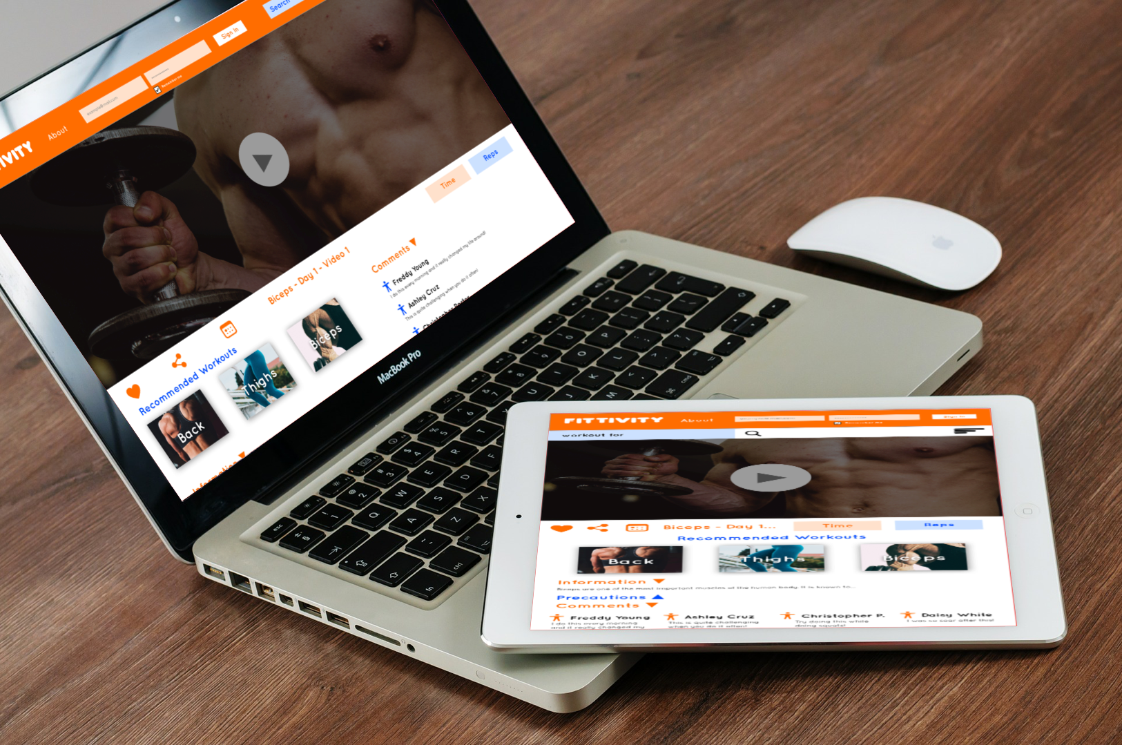
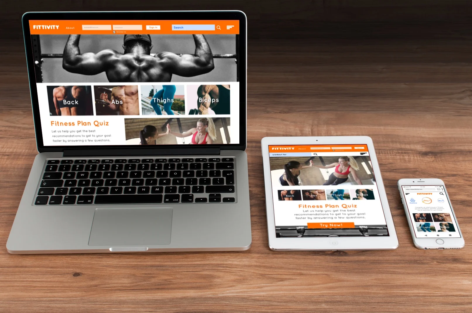
Understanding Fittivity’s different breakpoints let’s us know that it can be used on multiple platforms. Take a look below the different aspects of design that Fittivity is on like mobile, tablet and desktop versions.
Final UI Design and Prototype
Lastly, the final design was created considering all user research, layout requirements and selection of visuals. Using InVision, the final prototype was created.


